
I just posted a tweet asking how best to dissuade a colleague from presenting results using Excel.

The post had a fair impact – many likes and retweets – but also a lot of people saying, in tones from puzzlement to indignation, that they saw nothing wrong with Excel and this tweet just showed intellectual snobbery on my part.
A proper answer to those 31 replies deserves more than the 280 character Twitter limit, so here it is.
First, this is not an anti-Microsoft thing. When I say “Excel” I include Apple’s Numbers and LibreOffice’s Calc. I mean any spreadsheet program, of which Excel is overwhelmingly the market leader. The brand name has become the generic term, as happened with Hoover and Xerox.
Secondly, there is nothing intrinsically wrong with Excel itself. It is really useful for some purposes. It has spread so widely because it meets a real need. But for many purposes, particularly in my own field (physics) it is, for reasons discussed below, usually the wrong tool.
The problem is that people who have been introduced to it at an early stage then use it because it’s familiar, rather than expending the effort and time to learn something new. They end up digging a trench with a teaspoon, because they know about teaspoons, whereas spades and shovels are new and unfamiliar. They invest lots of time and energy in digging with their teaspoon, and the longer they dig the harder it is to persuade them to change.

The first and obvious problem is that Excel is a tool for business. Excel tutorials and examples (such as that above) are full of sales, costs, overheads, clients and budgets. That’s where it came from, and why it’s so widely used. Although it deals with numbers, and thanks to the power of mathematics numbers can be used to count anything, the tools it provides to manipulate those numbers – the algebraic formulae the graphs and charts – are those that will be useful and appropriate for business.
That bias could be overcome, but there is a second and much bigger problem. Excel integrates the data and the analysis. You start with a file containing raw numbers. Working within that file you create a chart: you specify what data to plot and how to plot it (colours, axes and so forth). The basic data is embellished with calculations, plots, and text to make (given time and skill) a meaningful and informative graphic.
In the alternative approach (the spade or shovel of the earlier analogy) is to write a program (using R or Python or Matlab or Gnuplot or ROOT or one of the many other excellent languages) which takes the data file and makes the plots from it. The analysis is separated from the data.
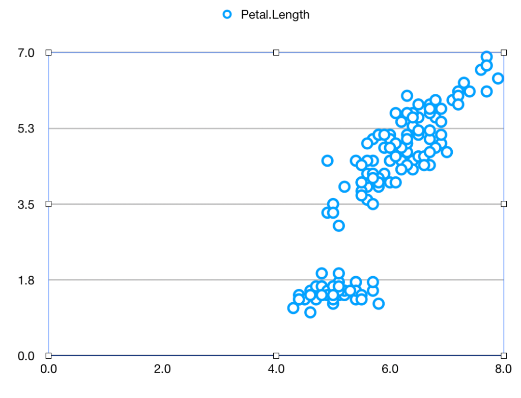
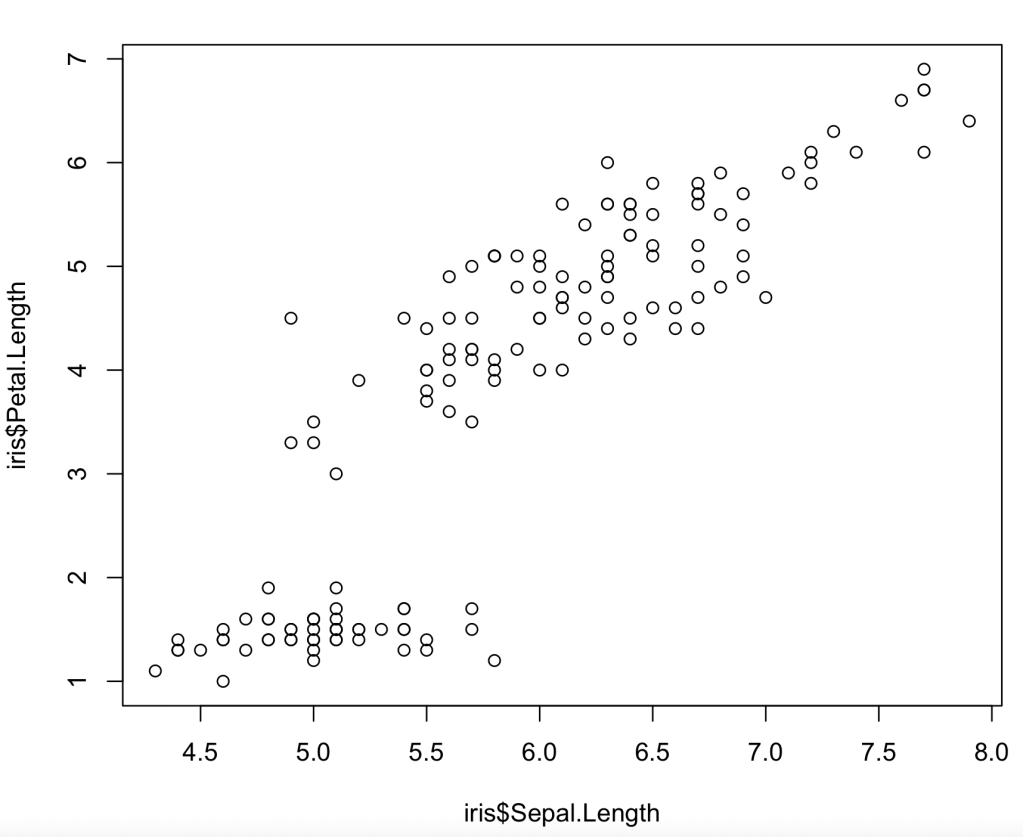
Let’s see how this works and why the difference matters. As a neutral example, we’ll take the iris data used by Fisher and countless generations of statistics students. It’s readily available. Let’s suppose you want to plot the Sepal length against the Petal length for all the data. It’s very easy, using a spreadsheet or using a program
Using Apple Numbers (other spreadsheets will be similar) you download the iris data file, open it, and click on
- Chart
- Scatter-plot icon.
- “Add Data”
- Sepal Length column
- Petal Length column
and get
In R (other languages will be similar) you read the data (if necessary) and then draw the desired plot
iris=read.csv("filename")
plot(iris$Sepal.Length, iris$Petal.length)
and get
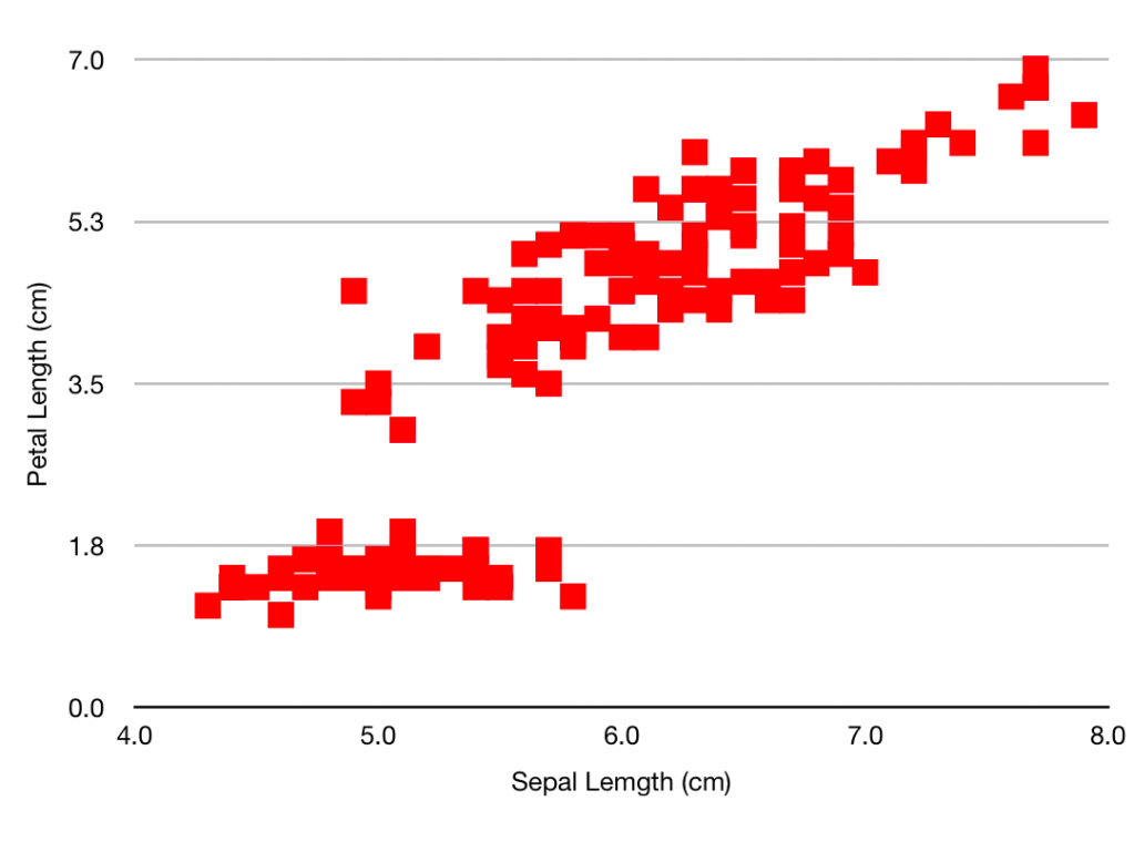
Having looked at your plot, you decide to make it presentable by giving the axes sensible names, by plotting the data as solid red squares, by specifying the limits for x as 4 – 8 and for y as 0 – 7, and removing the ‘Petal length’ title.
Going back to the spreadsheet you click on:
- The green tick by the ‘Legend’ box, to remove it
- “Axis”
- Axis-scale Min, and insert ‘4’ (the other limits are OK)
- Tick ‘Axis title’
- Where ‘Value Axis’ appears on the plot, over-write with “Sepal Length (cm)”
- ‘Value Y’
- Tick ‘Axis title’
- Where ‘Value Axis’ appears, over-write with “Petal Length(cm)”
- “Series”
- Under ‘Data Symbols’ select the square
- Click on the chart, then on one of the symbols
- “Style”
- ‘Fill Color’ – select a nice red
- ‘Stroke Color’ – select the same red
In R you type the same function with some extra arguments
plot(iris$Sepal.Length,iris$Petal.Length,xlab="Sepal length (cm)", ylab="Petal length (cm)", xlim=c(4,8), ylim=c(0,7), col='red', pch=15)
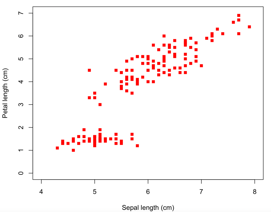
So we’ve arrived at pretty much the same place by the two different routes – if you want to tweak the size of the symbols or the axis tick marks and grid lines, this can be done by more clicking (for the spreadsheet) or specifying more function arguments (for R). And for both methods the path has been pretty easy and straightforward, even for a beginner. Some features are not immediately intuitive (like the need to over-write the axis title on the plot, or that a solid square is plotting character 15), but help pages soon point the newbie to the answer.
The plots may be the same, but the means to get there are very different. The R formatting is all contained in the line
plot(iris$Sepal.Length,iris$Petal.Length,xlab="Sepal length (cm)", ylab="Petal length (cm)", xlim=c(4,8), ylim=c(0,7), col='red', pch=15)
whereas the spreadsheet uses over a dozen point/click/fill operations. Which are nice in themselves but make it harder to describe what you’ve done – that left hand column up above is much longer than the one on the right. And that was a specially prepared simple example. If you spend many minutes of artistic creativity improving your plot – changing scales, adding explanatory features, choosing a great colour scheme and nice fonts – you are highly unlikely to remember all the changes you made, to be able to describe them to someone else, or to repeat them yourself for a similar plot tomorrow. And the spreadsheet does not provide such a record, not in the same way the code does.
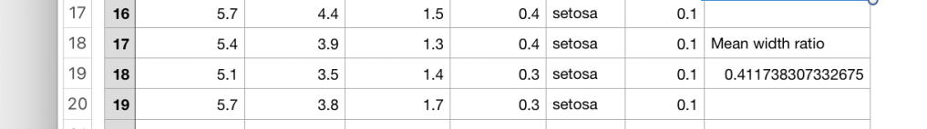
Now suppose you want to process the data and extract some numbers. As an example, imagine you want to find the mean of the petal width divided by the sepal width. (Don’t ask me why – I’m not a botanist).
- Click on rightmost column header (“F”) and Add Column After.
- Click in cell G2, type “=”, then click cell C2, type “/”, then cell E2, to get something like this

(notice how your “/” has been translated into the division-sign that you probably haven’t seen since primary school. But I’m letting my prejudice show…)
- Click the green tick, then copy the cell to the clipboard by Edit-Copy or Ctrl-C or Command-C
- Click on cell G3, then drag the mouse as far down the page as you can, then fill those cells by Edit-Paste or Ctrl-V or Command-V
- Scroll down the page, and repeat until all 150 rows are filled
- Add another column (this will be H)
- Somewhere – say H19 – insert “=” then “average(“,click column G , and then “)”. Click the green arrow
- Then, because it is never good just to show numbers, in H18 type “Mean width ratio”. You will need to widen the column to get it to fit
Add two lines to your code:
> ratio=iris$Petal.Width/iris$Sepal.Width
> print(paste("Mean width ratio",mean(ratio)))
[1] "Mean width ratio 0.411738307332676"
It’s now pretty clear that even for this simple calculation the program is a LOT simpler than the spreadsheet. It smoothly handles the creation of new variables, and mathematical operations. Again the program is a complete record of what you’ve done, that you can look at and (if necessary) discuss with others, whereas the contents of cell 19 are only revealed if you click on it.
As an awful warning of what can go wrong – you may have spotted that the program uses “mean” whereas the spreadsheet uses “average”. That’s a bit off (Statistics 101 tells us that the mode, the mean and the median are three different ‘averages’) but excusable. What is tricky is that if you type “mean(” into the cell, this gets autocorrected to “median(“. What then shows when you look at the spreadsheet is a number which is not obviously wrong. So if you’re careless/hurried and looking at your keyboard rather than the screen, you’re likely to introduce an error which is very hard to spot.
This difference in the way of thinking is brought out if/when you have more than one possible input dataset. For the program, you just change the name of the data file and re-run it. For the spreadsheet, you have to open up the new file and repeat all the click-operations that you used for the first one. Hopefully you can remember what they are – and if not, you can’t straightforwardly re-create them by examining the original spreadsheet.
So Excel can be used to draw nice plots and extract numbers from a dataset, particularly where finance is involved, but it is not appropriate
- If you want to show someone else how you’ve made those plots
- If you are not infallible and need to check your actions
- If you want to be able to consider the steps of a multi-stage analysis
- If you are going to run the same, or similar, analyses on other datasets
and as most physics data processing problems tick all of these boxes, you shouldn’t be using Excel for one.


