What’s wrong with Excel?

I just posted a tweet asking how best to dissuade a colleague from presenting results using Excel.

The post had a fair impact – many likes and retweets – but also a lot of people saying, in tones from puzzlement to indignation, that they saw nothing wrong with Excel and this tweet just showed intellectual snobbery on my part.

A proper answer to those 31 replies deserves more than the 280 character Twitter limit, so here it is.

First, this is not an anti-Microsoft thing. When I say “Excel” I include Apple’s Numbers and LibreOffice’s Calc. I mean any spreadsheet program, of which Excel is overwhelmingly the market leader. The brand name has become the generic term, as happened with Hoover and Xerox.

Secondly, there is nothing intrinsically wrong with Excel itself. It is really useful for some purposes. It has spread so widely because it meets a real need. But for many purposes, particularly in my own field (physics) it is, for reasons discussed below, usually the wrong tool.

The problem is that people who have been introduced to it at an early stage then use it because it’s familiar, rather than expending the effort and time to learn something new. They end up digging a trench with a teaspoon, because they know about teaspoons, whereas spades and shovels are new and unfamiliar. They invest lots of time and energy in digging with their teaspoon, and the longer they dig the harder it is to persuade them to change.

From the Apple Numbers standard example. It’s all about sales.

The first and obvious problem is that Excel is a tool for business. Excel tutorials and examples (such as that above) are full of sales, costs, overheads, clients and budgets. That’s where it came from, and why it’s so widely used. Although it deals with numbers, and thanks to the power of mathematics numbers can be used to count anything, the tools it provides to manipulate those numbers – the algebraic formulae the graphs and charts – are those that will be useful and appropriate for business.

That bias could be overcome, but there is a second and much bigger problem. Excel integrates the data and the analysis. You start with a file containing raw numbers. Working within that file you create a chart: you specify what data to plot and how to plot it (colours, axes and so forth). The basic data is embellished with calculations, plots, and text to make (given time and skill) a meaningful and informative graphic.

In the alternative approach (the spade or shovel of the earlier analogy) is to write a program (using R or Python or Matlab or Gnuplot or ROOT or one of the many other excellent languages) which takes the data file and makes the plots from it. The analysis is separated from the data.

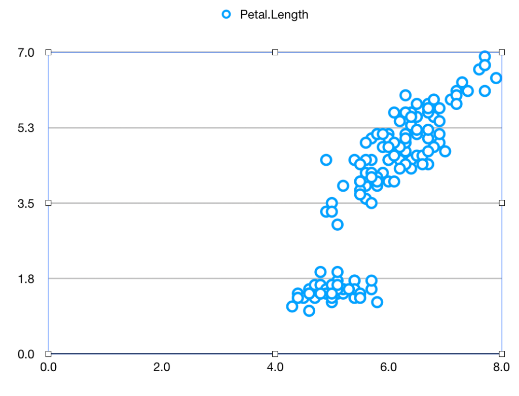
Let’s see how this works and why the difference matters. As a neutral example, we’ll take the iris data used by Fisher and countless generations of statistics students. It’s readily available. Let’s suppose you want to plot the Sepal length against the Petal length for all the data. It’s very easy, using a spreadsheet or using a program

Using Apple Numbers (other spreadsheets will be similar) you download the iris data file, open it, and click on

  • Chart
  • Scatter-plot icon.
  • “Add Data”
  • Sepal Length column
  • Petal Length column

and get

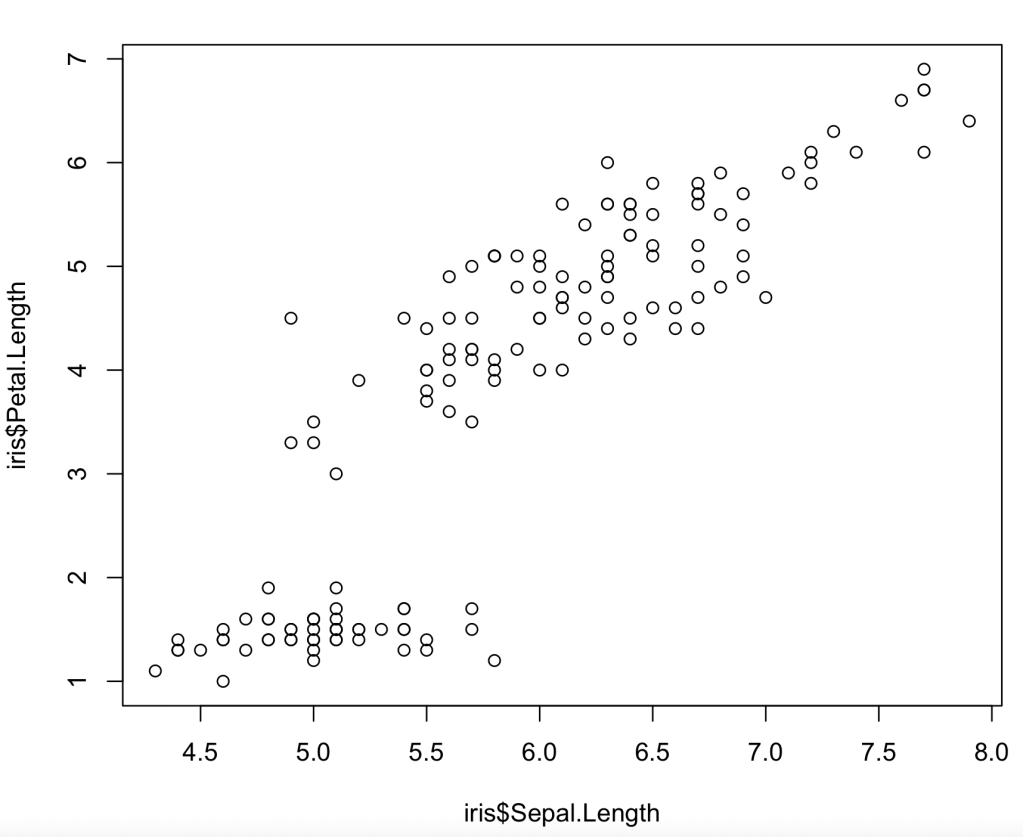
In R (other languages will be similar) you read the data (if necessary) and then draw the desired plot

iris=read.csv("filename")
plot(iris$Sepal.Length, iris$Petal.length)

and get
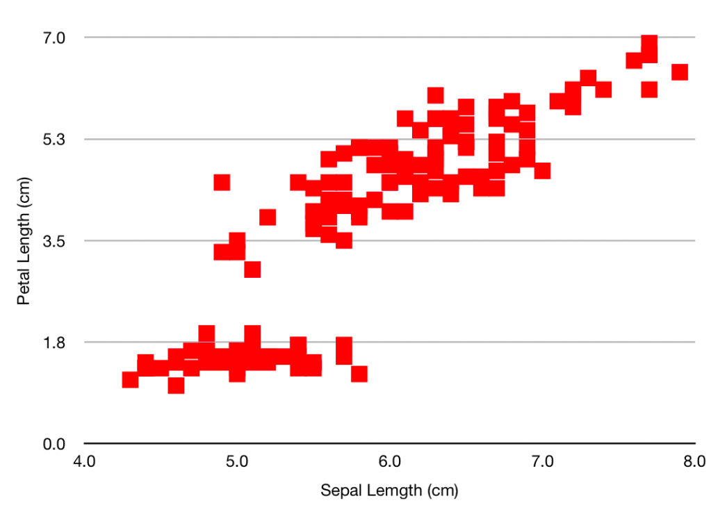
Having looked at your plot, you decide to make it presentable by giving the axes sensible names, by plotting the data as solid red squares, by specifying the limits for x as 4 – 8 and for y as 0 – 7, and removing the ‘Petal length’ title.

Going back to the spreadsheet you click on:

  • The green tick by the ‘Legend’ box, to remove it
  • “Axis”
  • Axis-scale Min, and insert ‘4’ (the other limits are OK)
  • Tick ‘Axis title’
  • Where ‘Value Axis’ appears on the plot, over-write with “Sepal Length (cm)”
  • ‘Value Y’
  • Tick ‘Axis title’
  • Where ‘Value Axis’ appears, over-write with “Petal Length(cm)”
  • “Series”
  • Under ‘Data Symbols’ select the square
  • Click on the chart, then on one of the symbols
  • “Style”
  • ‘Fill Color’ – select a nice red
  • ‘Stroke Color’ – select the same red

In R you type the same function with some extra arguments

plot(iris$Sepal.Length,iris$Petal.Length,xlab="Sepal length (cm)", ylab="Petal length (cm)", xlim=c(4,8), ylim=c(0,7), col='red', pch=15)
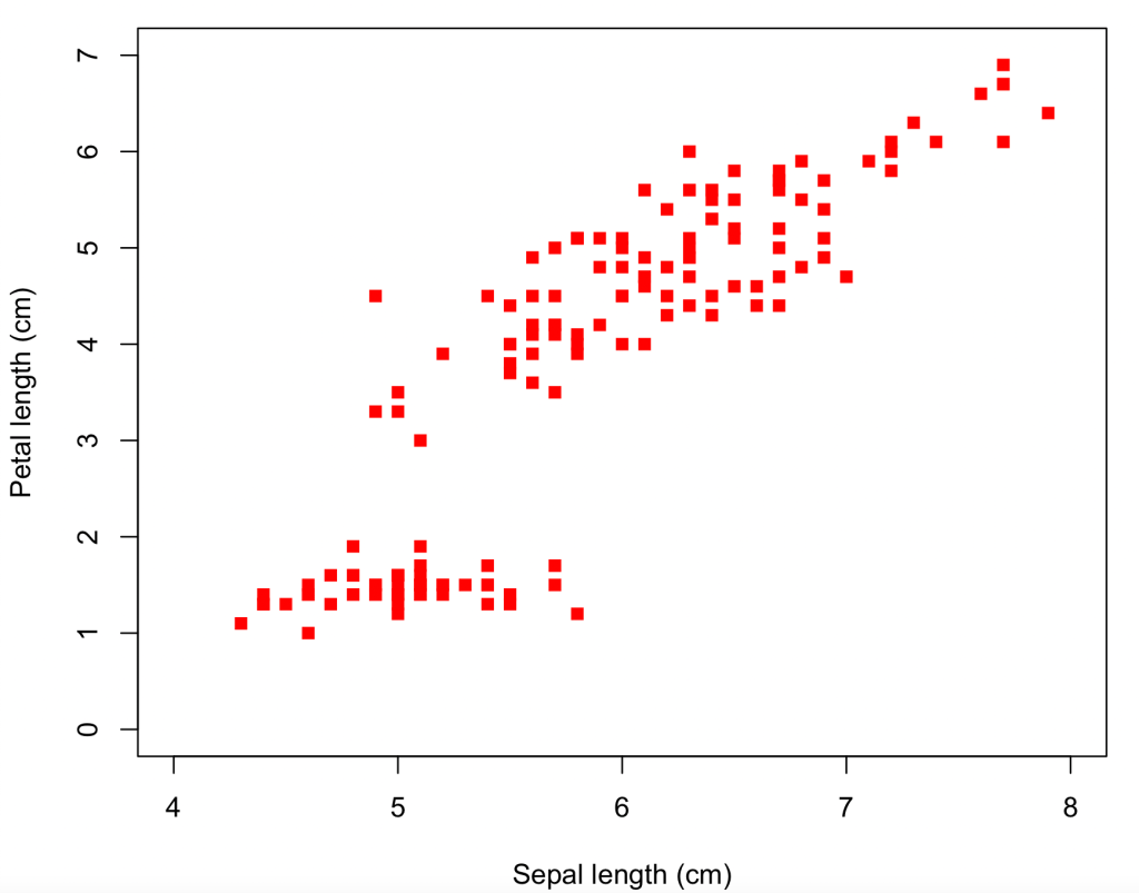
So we’ve arrived at pretty much the same place by the two different routes – if you want to tweak the size of the symbols or the axis tick marks and grid lines, this can be done by more clicking (for the spreadsheet) or specifying more function arguments (for R). And for both methods the path has been pretty easy and straightforward, even for a beginner. Some features are not immediately intuitive (like the need to over-write the axis title on the plot, or that a solid square is plotting character 15), but help pages soon point the newbie to the answer.

The plots may be the same, but the means to get there are very different. The R formatting is all contained in the line

plot(iris$Sepal.Length,iris$Petal.Length,xlab="Sepal length (cm)", ylab="Petal length (cm)", xlim=c(4,8), ylim=c(0,7), col='red', pch=15)

whereas the spreadsheet uses over a dozen point/click/fill operations. Which are nice in themselves but make it harder to describe what you’ve done – that left hand column up above is much longer than the one on the right. And that was a specially prepared simple example. If you spend many minutes of artistic creativity improving your plot – changing scales, adding explanatory features, choosing a great colour scheme and nice fonts – you are highly unlikely to remember all the changes you made, to be able to describe them to someone else, or to repeat them yourself for a similar plot tomorrow. And the spreadsheet does not provide such a record, not in the same way the code does.

Now suppose you want to process the data and extract some numbers. As an example, imagine you want to find the mean of the petal width divided by the sepal width. (Don’t ask me why – I’m not a botanist).

  • Click on rightmost column header (“F”) and Add Column After.
  • Click in cell G2, type “=”, then click cell C2, type “/”, then cell E2, to get something like this

(notice how your “/” has been translated into the division-sign that you probably haven’t seen since primary school. But I’m letting my prejudice show…)

  • Click the green tick, then copy the cell to the clipboard by Edit-Copy or Ctrl-C or Command-C
  • Click on cell G3, then drag the mouse as far down the page as you can, then fill those cells by Edit-Paste or Ctrl-V or Command-V
  • Scroll down the page, and repeat until all 150 rows are filled
  • Add another column (this will be H)
  • Somewhere – say H19 – insert “=” then “average(“,click column G , and then “)”. Click the green arrow
  • Then, because it is never good just to show numbers, in H18 type “Mean width ratio”. You will need to widen the column to get it to fit

Add two lines to your code:

> ratio=iris$Petal.Width/iris$Sepal.Width
> print(paste("Mean width ratio",mean(ratio)))
[1] "Mean width ratio 0.411738307332676"

It’s now pretty clear that even for this simple calculation the program is a LOT simpler than the spreadsheet. It smoothly handles the creation of new variables, and mathematical operations. Again the program is a complete record of what you’ve done, that you can look at and (if necessary) discuss with others, whereas the contents of cell 19 are only revealed if you click on it.

As an awful warning of what can go wrong – you may have spotted that the program uses “mean” whereas the spreadsheet uses “average”. That’s a bit off (Statistics 101 tells us that the mode, the mean and the median are three different ‘averages’) but excusable. What is tricky is that if you type “mean(” into the cell, this gets autocorrected to “median(“. What then shows when you look at the spreadsheet is a number which is not obviously wrong. So if you’re careless/hurried and looking at your keyboard rather than the screen, you’re likely to introduce an error which is very hard to spot.

This difference in the way of thinking is brought out if/when you have more than one possible input dataset. For the program, you just change the name of the data file and re-run it. For the spreadsheet, you have to open up the new file and repeat all the click-operations that you used for the first one. Hopefully you can remember what they are – and if not, you can’t straightforwardly re-create them by examining the original spreadsheet.

So Excel can be used to draw nice plots and extract numbers from a dataset, particularly where finance is involved, but it is not appropriate

  • If you want to show someone else how you’ve made those plots
  • If you are not infallible and need to check your actions
  • If you want to be able to consider the steps of a multi-stage analysis
  • If you are going to run the same, or similar, analyses on other datasets

and as most physics data processing problems tick all of these boxes, you shouldn’t be using Excel for one.

Antineutrinos and the failure of Occam’s Razor

William Of Ockham is one of the few medieval theologian/philosophers whose name survives today, thanks to his formulation of the principle known as Occam’s Razor. In the original latin, if you want to show off, it runs Non sunt multiplicanda entia sine necessitate, or Entities are not to be multiplied without necessity, which can be loosely paraphrased as The simplest explanation is the best one, an idea that is as attractive to a  21st century audience as it was back in the 14th.

 William of Ockham

Now fast forward a few centuries and let’s try and apply this to the neutrino. People talk about the “Dirac Neutrino” but that’s a bit off-target. Paul Dirac produced the definitive description not of the neutrino but of the electron. The Dirac Equation shows – as explained in countless graduate physics courses – that there have to be 2×2=4 types of electron: there are the usual negatively charged ones and the rarer positively charged ones (usually known as positrons), and for each of these the intrinsic spin can point along the direction of motion (‘right handed’) or against it (‘left handed’). The charge is a basic property that can’t change, but handedness depends on the observer (if you and I observe and discuss electrons while the two of us are moving, we will agree about their directions of spin but not about their directions of motion.)

Paul Dirac, 1933

Dirac worked all this out to describe how the electron experienced the electromagnetic force.  But it turned out to be the key to describing its behaviour in the beta-decay weak force as well. But with a twist. Only the left handed electron and the right handed positron  ‘feel’ the weak force. If you show a right handed electron or a left handed positron to the W particle that’s responsible for the weak force then it’s just not interested.   This seems weird but has been very firmly established by decades of precision experiments.

(If you’re worried that this preference appears to contradict the statement earlier that handedness is observer-dependent then well done! Let’s just say I’ve oversimplified a bit, and the mathematics really does take care of it properly. Give yourself a gold star, and check out the difference between ‘helicity’ and ‘chiralilty’ sometime.) 

Right, that’s enough about electrons, let’s move on to neutrinos. They also interact weakly, very similarly to the electron: only the left-handed neutrino and the right-handed antineutrino are involved, and the right-handed neutrino and left-handed antineutrino don’t.

But it’s worse than that. The left handed neutrino and right handed antineutrino don’t interact weakly: they also don’t interact electromagnetically because the neutrino, unlike the electron, is neutral. And they don’t interact strongly either. In fact they don’t interact full stop.  

And this is where William comes in wielding his razor. Our list of fundamental particles includes this absolutely pointless pair that don’t participate at all. What’s the point of them? Can’t we rewrite our description in a way that leaves them out?

And it turns out that we can.

Ettore Majorana

Ettore Majorana, very soon after Dirac published his equation for the electron, pointed out that for neutral particles a simpler outcome was possible. In his system the ‘antiparticle’ of the left-handed neutrino is the right-handed neutrino. The neutrino, like the photon, is self-conjugate. The experiments that showed that neutrinos and antineutrinos were distinct (neutrinos produce electrons in targets: antineutrinos produce positrons) in fact showed the difference between left-handed and right-handed neutrinos. There are only 2 neutrinos and they both interact, not 2×2 where two of the foursome just play gooseberry.

So hooray for simplicity. But is it?

The electron (and its heavier counterparts, the mu and the tau) is certainly a Dirac particle. So are the quarks, both the 2/3 and the -1/3 varieties. If all the other fundamental fermions are Dirac particles, isn’t it simpler that the neutrino is cut to the same pattern, rather than having its own special prescription? If we understand electrons – which it is fair to say that we do – isn’t it simpler that the neutrino be just a neutral version of the electron, rather than some new entity introduced specially for the purpose?

And that’s where we are. It’s all very well advocating “the simple solution” but how can you tell what’s simple? The jury is still out. Hopefully a future set of experiments (on neutrinoless double beta decay) will give an answer on whether a neutrino can be its own antiparticle, though these are very tough and will take several years. After which we will doubtless see with hindsight the simplicity of the answer, whichever it is, and tell each other that it should have been obvious thanks to William.   But at the moment he’s not really much help.

Probability and job applications

In preparing a recent talk on probability for physics grad students – it’s here if you’re interested – I thought up a rather nice example to bring out a key feature of frequentist probability. I decided not to include it, as the talk was already pretty heavy, but it seemed too good an illustration to throw away. So here it is.

Suppose you’ve applied for a job. You make the short list and are summoned for interview. You learn that you’re one of 5 candidates.

So you tell yourself – and perhaps your partner – not to get too hopeful.  There’s only a 20% probability of your getting the job.

But that’s wrong.

That 20% number is a joint property of yourself and what statisticians call the collective, or the ensemble.  Yes, you are one of a collective of 5 candidates, but those candidates are not all the same.

Let me tell you – from my experience of many job interviews, good and bad, on both sides of the table, about those 5 candidates .

hiring-1977803_1280

One candidate will not turn up for the interview. Their car will break down, or their flight will be cancelled, or they will be put in Covid-19 quarantine. Whether their subconscious really doesn’t want them to take this job, or they have a guardian angel who knows it would destroy them, or another candidate is sabotaging them, or they’re just plain unlucky, they don’t show.   There’s always one.

A second candidate will be hopeless. They will have submitted a very carefully prepared CV and application letter that perfectly match everything in the job specification, bouncing back all the buzz-words and ticking all the boxes so that HR says they can’t not be shortlisted. But at the interview they turn out to be unable to do anything except repeat how they satisfy all the requirements, they’ll show no signs of real interest in the work of the job apart from the fact that they desperately want it.

The third candidate will be grim. Appointable, but only just above threshold. The members of the panel who are actually going to work with them are thinking about how they’re going to have to simplify tasks and provide support and backup, and how they really were hoping for someone better than this.

Candidate four is OK.  Someone who understands the real job, not just the job spec in  the advert, and who has some original (though perhaps impractical) ideas. They will make a success of the job and though there will be occasional rough patches they won’t need continual support.

Candidate five is a star. Really impressive qualification and experience on paper, glowing references, and giving a superb interview performance, answering questions with ease and enthusiasm and using them to say more. They will certainly get offered the job – at which point they will ask for a delay, and it will become clear that they’re also applying for a much better job at a superior institution, and that they don’t really want this one which is only an insurance in case they don’t get their top choice.

So there are the five. (Incidentally, they are distributed evenly between genders, backgrounds and ethnicities). Don’t tell yourself your chance is 20%. That’s true only in the sense that your chance of being male (as opposed to female) is 50%.  Which it is, as far as I’m concerned, but certainly not as far as you’re concerned.

Instead ask yourself – which of the five candidates are you?

(If you don’t know, then you’re candidate #3)


Beginning of a blog

This is actually my third blog.

The first was at the general election in 2010, when I was standing as the Lib Dem candidate in Macclesfield. It was early days for social media campaigns and look pretty primitive now. It includes a passionate Liberal Democrat pledge to abolish student fees – subsequent events made me feel pretty sick about that. I didn’t quit the party, but it was close.

The second charted events in the Huddersfield Accelerator Institute, and it gave way of recording a lot of the things we did. I got some of the students to write some of the posts, which was good.  It’s not clear if anyone ever read it, and all the university blogs seem to have dropped out of sight in a recent web reorganisation.

So this, my third, is a retirement project. (Well, it’s better than taking up golf or buying a motorbike.) As any researcher will tell you, the urge to find out about things is closely linked to a ‘mission to explain’ need to share them with other people.  Before retirement, teaching students gave me that outlet.  This is a substitute.  When I’ve understood (by hard struggle or by blinding insight) something in physics, or statistics, or whatever, this will give me a platform to tell others about it.

Of course there’s no guarantee that anyone will read it – there is so much published on the web. But I can only try, and see what happens.