Perhaps the abstract was once a brief summary of the full paper. That is now largely history. In these days of the information explosion the abstract’s purpose is to let the reader know whether they want to spend the time reading your whole paper – which may possibly involve them in the hassle of downloading it and even fighting a paywall.
So there are two aspects: you want to make it inviting: you want the right peer group to read and heed it, and in some cases you want the conference organisers to select it for a talk or poster. `But you also need to inform those who wouldn’t find it relevant that they’d be wasting their time going further.
So it is not a summary. It is not a precis. It does not have to cover everything in your paper. You cannot assume the potential reader (who is probably scrolling down a long list of many such abstracts) will read your abstract all the way through: they will take a glance at the first couple of lines and only read further if you’ve caught their attention.
After writing and reading (and not reading) many abstracts, I have come to rely on the 4 sentence system. It gives a sure-fire mechanism for producing high quality abstracts, it does not involve any staring at a blank sheet of paper waiting for inspiration, and it is also flexible. It works for experimental and theoretical papers, and for simulations. It is good for the reader and the author.
The 4 Sentence Abstract
What you did. This is the opening which will catch the reader’s eye and their attention. Keep it short and specific. Don’t mention your methodology. “We describe the 4 sentence system for writing an abstract.”
Why this is important. This is why you chose to work on this topic, way back when. The core specialist readers will know this, of course, but will be happy to have their views confirmed and reinforced: for those in the field but not quite so specialised it may be necessary to justify the work you’ve done. “Many authors find it difficult to write their abstract, and many paper abstracts are long and unhelpful.”
How your result improves on previous ones. This is your chance to big-up what you’ve done. You have more data, or better apparatus, or a superior technique, or whatever. Now you can mention your methodology, insofar as it’s an improvement on previous work. “Our technique provides an easy-to-use methodical system.”
Give the result. If possible, the actual result, particularly if it’s a relatively straightforward measurement. If (but only if) you are submitting an abstract to a future conference and you havn’t actually got your results yet, you may have to paraphrase this as “Results for … are given.” People using it spend less time writing, and the abstracts they produce are better.”
This is a starting framework which can be adapted. The 4 “sentences” can be split if necessary, their relative length and emphasis varied according to the paper they describe. But it fits pretty much every situation, and it gives a thematic organisation which matches the potential reader’s expectation. (You can write it in the first or third person, active or passive, depending on your preferences and the tradition of your field, provided you’re consistent.)
There is a lot of advice about abstracts around on the web. Many of them are, to my mind, unhelpful in that they see the abstract through the eyes of the author, as a summary based on the paper, rather than through the eyes of a potential reader. I’ve taken to using the 4 sentences: what we did, why it matters, how it’s better, and the result. I now find writing abstracts quick and straightforward, and the results are pretty good.
This is based on a talk I once gave to a physics teachers conference to see how far one could get explaining particle physics without using lots of maths and equations but just concepts familiar from A-level physics.
For what it’s worth, the feedback I got afterwards was that it was entertaining but far too difficult. I’d failed dismally. Let’s try again, slowly…
First, what’s a field? For today’s purposes, it’s a numerical quantity which is defined everywhere. A good example (though it’s macroscopic not microscopic) is temperature: There is some T(r,t) which has a value for any r and t, even in places a thermometer couldn’t reach.
Another familiar example is the magnetic fieldB. This is a vector so it has three components, it makes a compass needle point in a particular direction, and has a strength, which determines whether the needle twists gently or forcefully. In the same way there is an electric fieldE which pushes charges, with some strength and in some direction.
These have been known since the times of the ancient Greeks and Chinese, and physicists in the 19th century spent a lot of effort investigating them and discovered many laws: Coulomb’s law, the Biot-Savart law… which we now summarise as Maxwell’s Equations for the Electromagnetic field, unifying them. There are 3+3= 6 elements in B and E, but if you write them in terms of potentials (φ and A) that can be reduced to 4, and further algebra exploiting the ambiguity in A reduces this to 3.
Maxwell’s equations say that a changing magnetic field produces an electric field (that’s how generators work) and likewise a changing electric field makes a magnetic field, so it’s not surprising that a bit of algebra (2nd year undergraduate level) shows that the equations have solutions that are waves. These Electromagnetic Waves are familiar to us as radio, microwaves, visible light and so on.
It turns out that these waves can’t have any arbitrary energy, only in quanta of a particular packet size, like lumps of sugar rather than powdered. The packet size depends on the frequency, E=hf, so this lumpiness is unimportant for radio waves, becomes noticeable for visible light (as in the photoelectric effect) and is really significant for gamma rays.
An electromagnetic wave packet has energy hf and momentum h/λ and when it starts doing stuff: colliding with atoms, getting absorbed or emitted, it behaves like a particle does. We call it a photon.
Fields → Equations → Wave solutions →particles
At this point you’re probably expecting me to spring a surprise on you. “That’s the traditional 19th/20th century view of the photon, but now we know it’s something completely different…” No. This is the bottom line. The photon is the quantum of the wave solution of the equations governing the electromagnetic field. Any physicist will agree and accept this statement. (They might want to add some extras, but they would not say it was wrong.)
Now let’s consider electrons. These are blatantly particles, but they can diffract and interfere and their wave properties (frequency and wavelength) are related to their energy and momentum just like the photons’ are. We take the fields → particles pattern but start at the other end, suggesting that there is a field ψ(r,t) which somehow embodies the electron-ness at any point. This will obey some equations which have wavelike solutions, which are quantised and the packets are called electrons. Fine, although it turns out that to make it work ψ(r,t) has to have 4 components, which embody electrons and anti-electrons (positrons) with two spin states, up and down.
From electrons we move to neutrinos, and play the same game. The neutrino looks like a neutral electron, so it also has a 4-component field. Another way of looking at it is to call electrons and neutrinos ‘leptons’ and group them both together in one field with 8 components. We’ll come back to this.
Now let’s look at the up and down quarks. They are a pair like the electron and neutrino, but they also have ‘colour’ which has 3 values, so they get described by 8×3=24 fields. The 24 numbers of quarkness relate to the colour, the spin, whether its u or d, and particle or antiparticle. The way this is done is arbitrary: you could say (1,0,0,0,0,0,0,0,0,0,0,0,0,0,0,0,0,0,0,0,0,0,0,0) gave a red spin-down u quark and (0,1,0,…. ) a green spin-up d quark and so on – or whatever – but whatever system used has always got to have 24 separate numbers.
With 24 quark fields and 8 lepton fields that makes 32. So for the three generations (the c and s quarks with the mu and its neutrino, and the b and t quarks with the tau and its neutrino) that makes 96. (Plus 3 for the photon, don’t forget.)
Going back for a minute to the electron field, the numbers are complex, but the overall phase doesn’t matter, because everything gets squared to give probabilities. We might – it’s a free country – elevate this observation to a rule, and extend it by saying that changing the phase should not affect any results, even if the change is not the same everywhere but a function of space and time. Applying this local gauge invariance principle gives various unbalanced differentials in the electron equations and one is forced to introduce the photon field with balancing variations to cancel them: gauge invariance ‘predicts’ the photon. Maybe this sounds like no big deal. You can just make assumptions and write down the equations for the electron fields and for the photon fields, or you can assume the equations for the electron, assume local gauge invariance and then the electromagnetic force, the photon field, emerges. You can save one set of assumptions, but only at the cost of making another.
But then it turns out you can do the same trick with colour and the strong force. There are 3 colours so a quark colour state can be written as 3 numbers, but whether (1,0,0) corresponds to red or green or blue or some mixture is arbitrary (just as when we draw axes on a two dimensional map and start writing down co-ordinates). We can apply the local gauge invariance argument to colour, and to accommodate it we need new fields. These are like the photon and we call them gluons. Just as charges exchanging photons produce the electromagnetic force, colours exchanging gluons produce the strong force. In some ways gluons are just like photons, but in some ways they are different. One such difference is that they themselves have colour (whereas the photon is, of course, not charged) and there are 8 possible colours. That gives another 24 field components.
Encouraged by this, we can try to explain the weak force as arising from local gauge invariance applied to the electron/neutrino and u/d doublets. We can write an electron and a neutrino as (1,0) and (0,1) or the other way round, and applying local gauge invariance to this ambiguity gives 3 extra fields, call them W. But it doesn’t work. These gauge fields inevitably describe particles of zero (rest) mass. The photon indeed has zero rest mass and so, it turns out, do the gluons. But the particles that give the weak force have masses of many GeV. The ambiguity that reduces the 4 component (φ and A) fields to 3 only works when the particles are massless. In a sensibly-organised universe there would be 9 fields describing 3 massless particles carrying the weak force – and indeed for the first small fraction of a second in the early universe this was the case.
But then the Higgs field got involved. This involves two linked assumptions, one reasonable, one weird. First we suppose that there’s yet another field in the game, call it h for Higgs, a doublet like the electron/neutrino or u/d, and with distinct particles and antiparticles, but zero spin, so it takes 4 more fields. Which is fine – with all these fields/particles around there might as well be one more. Then we suppose that the lowest energy state for this field is not zero, but some finite value. That is odd. If you think of electric or magnetic fields, then the lowest energy state is to have zero field – you have to manipulate charges and currents if you want to make anything interesting happen. And all the other fields behave in the same sensible way: if all the ψ electron fields numbers are zero there are no electrons and no energy. Obvious. But the higgs is different: one of its 4 components has some ground state value, and to increase or decrease it means putting in energy.
There is a loose analogy with water in a fish tank. The universe is full of higgsness, or higgsosity, like the tank is full of water, and to take it away (i.e. for a bubble) needs energy. There is a much better analogy with the magnetic field in a ferromagnet. In its lowest energy state all the molecular dipoles are aligned in some direction, giving a non-zero magnetisation.
This unipresent higgsness makes the 3×3=9 massless W fields and the 4 h fields get mixed up, and what we see are 3×4=12 massive W fields (a mixture of the original W and h s; the neutral W gets mixed up with the photon as well and gets called Z but let’s not worry about that) and one lone h field. Either way, they sum to 13.
Adding them all up, that’s 96 fields for the quarks and leptons, 24 for the gluons, 3 for the photon, and 13 for the weak + higgs. That makes 136, if I’ve counted correctly. Everywhere, at every point in space-time, there are these 136 quantities, and they develop in time according to a prescribed and established set of rules. Seems complicated? Perhaps it is. Or perhaps it is, in some way we don’t understand yet, actually very simple.
Afterword
What are ‘the laws’? We have Maxwell’s equations for the photon but how do we begin to write down the equations obeyed by all the other 133 fields, which have to describe not just how they behave on their own but how they interact with each other?
We borrow a concept from classical mechanics called the Lagrangian, which goes back to Fermat’s principle of least action. Suppose there is some function L of all the fields and their time-differentials. L(f1,ḟ1,f2,ḟ2,…) and we then require (why not?) that the integral of L is a maximum (or minimum), then the requirement pops out that d/dt(dL/dḟi)=dL/dfi, for all i, and those are the required equations. If you buy into this, the question ‘What are the equations?’ becomes ‘What is the Lagrangian function?’ which is still wide open, but not quite so wide. We now think we know the answer: this is “The Standard Model” and bits of it appear from time to time on mugs and T shirts. It describes the behaviour of everything in the universe (except gravity, which we don’t talk about) and can be written on the back of an envelope, if the envelope is large enough. A4 will do.
Post-afterword
I don’t think there’s anything wrong in the above, but I’m aware that there’s an awful lot left out. Where do these numbers like 3 and 8 come from? What about parity violation? And Majorana neutrinos? And flavour changing in the weak interaction? I know, I know… The truth, nothing but the truth, and though not the whole truth, a large enough chunk of it for one session.
When you roll up to your local polling station on an election day, to do your civic duty and put a cross against your favourite candidate, you’re more than likely to be accosted on the way in by busy people armed with clipboards asking for your voter number.
They’re called tellers – but who are they? Why are they doing this? Should you tell them?
The answer to the third question is: yes, you should. To see why, we have to look at the first two.
The various rival political parties will have been canvassing for the past few weeks, knocking on doors and making phone calls. The purpose of this canvassing, in the run up just before the poll, is not so much to win people over (that’s a slow process) but to identify who might be going to vote for them on the day. With today’s low turnouts – below 50% for many elections – the seat goes to the party that can get its supporters out of their comfortably warm houses to make the trip to the polling station. So each contesting party has its list of the voters they think they can count on, and these lists, although incomplete and of varying accuracy, are vitally useful information for them. And your name is probably on one of them.
So come mid afternoon, in rival committee rooms across the ward or constituency, party volunteers will be setting off to call on their identified supporters to remind them that this is the day, and encourage them to make the trip.
But there’s no point calling on someone if they’ve already been to vote. And that’s where this collection of numbers comes in. When you give your number to a teller, it goes into their system and if your name is on their list of people to call on, it gets crossed off. By giving your number you avoid the hassle of a knock on the door. (Or several knocks on the door, in some cases.) Even if your instinctive response to a request for personal information is to tell the requestor to get knotted, its worth your while to conform this time.
Reading this you may be worried that your personal information is being kept, on computers and hardcopy, by political organisations. It is covered by the GDPR. You can ask what information a local party has about you and demand changes if it’s inaccurate, though I’ve never known of a case. Party volunteers are allowed to use it for political purposes but not for idle curiosity, though that’s unenforceable. You probably should be worried: if a tired canvasser mistakenly puts you down as a red-hot socialist and the information leaks, you are not going to start receiving Facebook posts for Jeremy Cornyn memorabilia, but it could scupper your application to join the golf club.
It’s normally very civilised. Tellers are allowed to ask for numbers, but cannot insist. They can wear rosettes in their party colours, which helps make clear they have no official status, and they absolutely mustn’t try to influence your vote. Tellers from different parties will call out numbers to each other and fraternise like WWI troops during a ceasefire, having shared the same experiences from different sides. When the poll closes the normal hostilities will resume, but for today we’re united against the common enemy of voter apathy.
Most English place names consist of two parts: a specific identifier and a general description. There are exceptions, of course, from Torpenhow Hill to Milton Keynes, but the usual pattern is for a split in the middle: Ox/ford, Cam/bridge, Man/chester, Hudders/field. The second part tells you what there is (or was, once) there, and the first is a specific identifier to distinguish it from all the other fords, bridges, chesters or fields.
Welsh place names work on exactly the same system. A typical place name has a generic part and a specific part. But in Welsh adjectives and possessives come after the noun, not before it as they do in English. So the generic comes before the specific, at the front rather than at the end.
You can draw up a table of equivalences, not that the actual names have much relevance after a few centuries of history. So that’s all plain sailing.
Aber-
-mouth
Rhyd-
-ford
Tre-
-ton
Caer-
-chester
Llan-
-church
Maes- or Ma-
-field
Pont-
-bridge
Common Welsh place name prefixes and matching English suffixes
The problem arises because an English speaker focusses on the first half of a place name. We think Manchester to distinguish it from Winchester or Barchester or all the other -chesters (and -casters) on the map. In Wales this backfires completely. If you think Abertawe your brain is going to group that with Aberteifi and Aberystwyth and all the others. An English visitor will see the names Trefach and Trefnant as closely similar, whereas for the Welsh they are as different as London and Swindon.
So the incomer has to train their brain to do what the locals do instinctively. When you come across a place name, focus on the second part. Think Caerdydd, Aberystwyth, Llandovery, Rhydychen …
And the map will be much easier to get your head round.
Like other sensible colleagues, I had refrained from drawing attention to a tricky problem which has been rumbling on for months. But now it’s been raised in the press, in an article which is very misleading in some places, perhaps the time has come to get some things straight.
Despite the headline, we are not atomic scientists. And we are not split. And physics is not ruined, it is getting on very nicely.
But we do have a problem: many international experimental collaborations include groups from Russia. How do we react to the invasion of Ukraine on February 24th 2022?
I can’t speak for everyone, but in my experience there has been no feeling against our Russian colleagues as individuals. They’re part of the team, getting on with the job under complicated political pressures. If we were all to be held accountable for the actions of our governments then we’d all be in trouble.
Where there is a reaction is with the Russian institutes. These are part of the Russian establishment, and some of their spokesmen have made very hawkish public statements justifying the invasion. Like many others, I have no stomach for appearing in a publication with such instruments of Putin, and by doing so appearing to condone their views and actions.
Institutes appear in two places in publications: in acknowledgements of support at the end of a paper, and as affiliations in the author list at the beginning. The acknowledgement of support is not a major issue: it can be presented as a bare statement of fact, the wording can be crafted, if desired, to be unenthusiastically neutral, and nobody reads this section anyway. But their prominent appearance in the author list is a problem.
We always do this: in one format or another, authors are listed together at the start of a paper with their university or laboratory affiliation. The word processing tools for writing papers expect this to happen and provide helpful macros. It’s so commonplace that nobody asks why we do this but I think there are three reasons:
It gives some credibility to a paper to know that the author has a position.
It gives a means of contacting the author if anyone wants to question or discuss the paper. This was surely the original reason, when all this started back in the 1800’s.
It distinguishes the author from someone else with the same name.
Looking at these in the cold light of reason, they’re pretty irrelevant in the 21st century. For a paper with hundreds of authors the academic status of any individual is irrelevant, for contact details we have google, and there are tools such as ORCID that are much more reliable for linking authorship to individuals. We can solve the whole problem by abandoning this archaic practice.
It is proving controversial. It is interesting is how many of us have a gut reaction against dropping our affiliation from our byline. It is a part of our professional identity: we are introduced, and introduce ourselves, as Dr … … from the University of … . It’s on our rarely-used business cards. It’s part of our email signature. So it’s a bit of a wrench to drop it, but we can get over it.
Some European funding agencies (not all, only a few) are unhappy as they use the number of times they appear in publications as a metric. Without commenting on whether this is a sensible way to allocate research funding, it should not take them long to write a computer script to use ORCIDs rather than whatever bean-counting they do at present.
In the cold war, which some of us still remember, scientific co-operation rose above politics and built important bridges of trust. That was the right thing to do yesterday, but it’s the wrong thing to do today. To ignore the invasion, or to postpone any consequences, is to play into Putin’s narrative that there is nothing to see except some minor police action. Dropping the listing of institute affiliations has been adopted by the BelleII and BaBar experiments, and is under consideration for those at the LHC. Meanwhile the science is still being done and published on the arXiv, which is where everyone accesses it anyway as it’s free to access and up to date. And the physicists are still working togther.
Most of the text and image files we handle are full of redundant information, and can (and should) be made much smaller without losing anything, which cuts down the storage needed or the time taken to transmit them, or both.
One way to do this is to analyse the file, notice commonly repeated patterns, and replace them by specific codes. But to do this you need to have the whole file, or a representative chunk of it, available before you start processing it. Sometimes you have a stream of characters coming at you and you need to compress them on the fly. The LZW algorithm provides a really neat way of doing this. I’ve been digging into this (for a program to create gif files, as it happens) and now I understand it I’m so impressed I want to share it.
The input characters will have a certain size. For ASCII text this is 8 bits. For a graphics you might use 4 bits to cover 16 possible colours for a simple image, or more if you’re being artistic. The codes output will each have a size which must be bigger than the input size. Let’s suppose, to keep it simple, you’re compressing a stream of 4 bit colours and using 7 bits each for the codes.
The coder has an input stream of characters, an output stream, a buffer, which is a string of input characters and is initially empty, and a dictionary which matches codes to character strings. This is initialised with predefined codes for strings of just 1 character, which are just the same with additional zeros. So in our example the characters 0 thru 15 are represented by the codes x00 thru x0F. Also code x10 is known as CLEAR and x11 is known as STOP. The remaining 238 codes, x12 thru x7F, can be defined by the user.
The coding algorithm is very simple
Get the next character from the input
Consider the string formed by appending this character to the buffer. Is it in the dictionary?
If so, add the character to the string, and go back to step 1
If not, add this string to the dictionary using the next available user code. Output the code corresponding to the existing buffer, clear the buffer and replace it by the single character, and go back to step 1
When there are no more input characters, output the code for the string in the buffer and then the `STOP code
It may seem odd to output the old code at step 4 rather than the new one you’ve just defined, but in fact this is very cunning, as we shall see.
Let’s see how this works in practice. Suppose we are encoding a picture which starts at the top with a lot of blue pixels of sky, and occasional white cloud pixels. Suppose that blue is colour 3 and white is colour 1.
The first pixel is 3, blue. The buffer is empty, so we consider the string <3>. Is it in the dictionary? Yes, it is one of the single-character predefined codes, so we just add it to the buffer.
We grab the next input, which is another 3. Is <33> in the dictionary? No, so we add it to the dictionary as code x12, the first user-defined code, output the code x03 for the buffer and replace it with the second character, <3>
Now we get the 3rd input, another 3. Is <33> in the dictionary? Yes, we’ve just added it. So we put <33> in the buffer.
The next input is another 3. <333> is not in the dictionary so we add it as x13, output the x12 code for <33>, and revert to <3> in the buffer.
More blue sky characters take the buffer to <33> and <333> but at <3333> we have to define a new code, output x13 for <333> and the buffer reverts to the single character <3>
So as the monotonous blue sky continues, we output codes representing increasingly long strings of blue pixels,. Eventually we encounter a character 1, the start of a white cloud. We output the code for <333…33>, define a (probably useless) code for <333..331>, stick the <1> in the buffer, and start defining codes for <11>, <111> and so on. “Emerging from the cloud we are back with strings of 3s for which we already have relevant codes in the dictionary, we don’t have to re-learn them.
So this is fine. For images with large areas of the same colour (or, indeed, for common repeated patterns) the method will build up a dictionary of useful codes which will achieve high compression: the extra bits in the length of the code are more than compensated for by the fact that a code represents long strings of characters. The 7 bit codes in our example will in practice have to be packed into conventional 32 bit computer words, which is tedious but straightforward. Our large image file of characters is compressed into a much smaller file of codes, which can be saved to disk or sent over the network.
But, you are probably wondering, what about the dictionary? Surely any program which is going to use this compressed file, perhaps to display it on a screen, needs to be sent the dictionary so it can interpret what all these user-defined codes mean? That’s going to be quite a size – and you would think that the dictionary has to be sent ahead of the data which it is going to be expanded.
The punch line, the beautiful cunning of the method, is that you don’t have to. The sequence of compressed codes contains in itself enough information for the interpreting program, the decoder, to rebuild the dictionary on the fly, as it processes the data.
Notice that at step 4 in the encoding process a code is output and a new code is defined. So whenever the decoder reads a code, it has to define a code for the input dictionary. This code is always the next available user code. So in our example the first code to be defined will be x12, then x13, and so on. The string it matches will be one character longer than that of the code just input, and the first characters will be those of that code: only the final one is unknown. And that will be the first character of whatever string is read next.
`So the decoding procedure is also very simple
Input a code
Except for the very first code, set the final character of your incomplete dictionary definition to be the first character from this code
Process this code – plot the characters on the screen, or output them to the expanded file, as appropriate
Create a new dictionary entry for the next available user code, with string length one element longer than the string for this code, and fill all elements but the last from the code you’ve just read.
“““““`
In our example, we first read the code x03 which is predefined as <3>. We define a dictionary entry for code x12, the first user code, as <3?>. The second code is x12 which enables us to complete this definition as <33>, while also creating a dictionary entry for x13 as <33?>. And so it continues.
Notice how in this instance the code x12 is being used to define itself . Which is why step 3 has to come after step 2. The code is not completely defined, but the important first character is.
`What happens if you run out of possible user codes? Maybe the picture is large or complicated and the 238 codes we get from 7 bits is not enough. Of course with careful planning you will have allowed enough space, but programmers are not always infallible. There are two options for dealing with this.
The simple choice is to use the CLEAR code. You flush all the user defined codes from the dictionary and start over. This may be appropriate if your blue/white sky at the top of the picture becomes a green/brown landscape towards the bottom. The decoder receives the code and likewise flushes its dictionary and builds a new one.
The better choice is to expand the code size. When all the 7 bit codes are used up, the encoder switches to producing 8 bit codes on the output. The decoder can recognise this: if all the codes are used up and there has been no CLEAR code sent it will assume that subsequent input codes are 1 bit longer. This involves a little more programming, but it’s usually worth the effort.
LZW stands for Lempel, Ziv and Welch, by the way. These three developed the method back in the dark ages of the 1980’s. They patented it – let’s hope they made lots of money, they deserve it – but these have now expired, leaving us free to use their nice algorithm without worries about getting sued.
As a new lecturer, in the early 1980’s, I soon learnt that the first meeting of the 3rd year examiners was the focal point of the physics department’s year. All the academics would be there: attendance was higher than at any seminar. Because this was the meeting that mattered.
Exams were over, and the marks had been collected and aggregated. Now the final-year students were to be awarded their degree classifications – a decision defining them for the rest of their lives. This was done to a clear scheme: 70% or above was a first, 60% a 2-1, and so on. Anyone making the threshold when all their marks were added got the degree, no question. But what about those just below the line with 69.9% or 58.8%? We reckoned we couldn’t mark more accurately than 2%, so anyone within that margin deserved individual consideration. The external examiner, plus a couple of internal assistants, would examine borderline candidates orally, typically going over a question in which they’d done uncharacteristically badly, to give them the chance to redeem the effects of exam panic or taking a wrong view. It was grim for the students, but we did out best, talking science with them, as one physicist to another, trying to draw out the behaviour characteristic of 1st class (or 2-1 or…) student.
But not all students in the borderlines could be interviewed. There were too many, not if the examining panel was to do the thorough job each candidate deserved. So a selection had to be made, and that’s what this meeting was for. Starting with students scoring 69.99 and working down the list, the chair would ask the opinions of those who knew the student – their tutors, director of studies, and anyone who had been in contact with them during their 3 year course – whether they thought this candidate was in the right place, or if they deserved a shot at the rung above. Those of us who knew an individual would give our opinion – usually in the upward direction, but not always. Medical evidence and other cases of distress was given. On the basis of all this information, the meeting would decide on the interview lists.
As we worked down from 69.99 to 67.00 the case for interview got harder to make. Those with inconsistent performance – between papers, between years – got special attention. This was done at all the borderlines (and in exceptional circumstances for some below the nominal 2% zone).
We were too large a department for me or anyone to know all the students, but we would each know a fair fraction of them, one way or another, with a real interest in their progress and this, their final degree. So it mattered. We were conscientious and careful, and as generous as we could be. At the end of the meeting, which would have lasted more than 2 hours, there was the cathartic feeling of a job well done.
The 2nd meeting of the 3rd year examiners would follow some days later. This was also well attended and important, but there was little opportunity for input. The interviews would have taken place, and the panel would make firm recommendations as to whether or not a students should be nudged up or left in place. The degree lists would be agreed and signed, and we would be done with that cohort of undergraduates and start preparing for the freshers who would replace them.
Until…
The university decided that exam marking should be anonymised. The most obvious effect was that the scripts had numbers rather than names, removing the only mildly interesting feature of the tedious business of marking. But a side effect was that the students in the examiners’ meetings became anonymised too. And if candidate 12345 has a score of 69.9%, I have no way of knowing whether this is my student Pat, keen and impressive in tutorials but who made a poor choice of a final year option, or Sam, strictly middle of the road but lucky in their choice of lab partner. There was no way for us to give real information about real people. The university produced sets of rules to guide the selection of candidates for interview, all we could do was rubber-stamp the application of the rules. People gave up attending. Eventually I did too.
By this point some readers’ heads will have exploded with anger. This tale of primitive practices must sound like an account of the fun we used to have bear-baiting and cock-fighting, and the way drowning a witch used to pull the whole village together. Yes, we were overwhelmingly (though not completely) white and male, though I never heard anyone make an overtly racist or sexist comment about a candidate, and I am very sure that anyone who had done so would have been shouted down. We were physicists judging other physicists, and in doing that properly there is no room for any other considerations. There may have been subconscious influences – though we would, by definition, be unaware of that. I can hear the hollow laughter from my non-white and/or female colleagues when I tell them the process wasn’t biassed. But it wasn’t very biassed – and it could not move people down, it could only refrain from moving them up. Although the old system had to go as it was open to unfair discriminatory prejudice, I don’t believe that in our department (and I wouldn’t be prepared to speak for anywhere else) we were unfair. But perhaps you shouldn’t take my word for that.
So the old unfair system based on professional judgement has been replaced by a new unjust system based on soulless number-crunching. There is no good solution: while we draw any line to divide individuals into classes – particularly the 2-1/2-2 border in the middle of the mark distribution – and while we measure something as multidimensional as ‘ability’ by a single number, there are going to be misclassifications. I had hoped that when, thanks to data protection legislation, universities had to publish transcripts of all the student’s marks rather than just the single degree class, that the old crude classification would become unimportant, but this shows no signs of happening.
There is no question that anonymous marking was needed. But any positive reform has some negative side effects, and this was one of them. The informed judgement of a community was replaced by a set of algorithms in a spreadsheet. And replacing personal and expert knowledge of students by numerical operations with spreadsheets is bound to bring injustices. Also a rare instance where the department acted as a whole, rather than as a collection of separate research groups, got wiped from existence.
It is amazing how simple computation can have profound complexity once you start digging.
Let’s take a simple example: finding the average (arithmetic mean) of a set of numbers. It’s the sort of thing that often turns up in real life, as well as in class exercises. Working from scratch you would write a program like (using C as an example: Python or Matlab or other languages would be very similar)
float sum=0;
for(int j=0;j<n;j++){
   sum += x[j];
   }
float mean=sum/n;
which will compile and run and give the right answer until one day, eventually, you will spot it giving an answer that is wrong. (Well, if you’re lucky you will spot it: if you’re not then its wrong answer could have bad consequences.)
What’s the problem? You won’t find the answer by looking at the code.
The float type indicates that 32 bits are used, shared between a mantissa and and exponent and a sign, and in the usual IEE754 format that gives 24 bits of binary accuracy, corresponding to 7 to 8 decimal places. Which in most cases is plenty.
To help see what’s going on, suppose the computer worked in base 10 rather than base 2, and used 6 digits. So the number 123456 would be stored as 1.23456 x 10⁵ . Now, in that program loop the sum gets bigger and bigger as the values are added. Take a simple case where the values all just happen to be 1.0. Then after you have worked through 1,000,000 of them, the sum is 100000, stored as 1.00000 x 10⁶ . All fine so far. But now add the next value. The sum should be 1000001, but you only have 6 digits so this is also stored as 1.00000 x 10⁶ . Ouch – but the sum is still accurate to 1 part in 106 . But when you add the next value, the same thing happens. If you add 2 million numbers, all ones, the program will tell you that their average is 0.5. Which is not accurate to 1 part in 106 , not nearly!
Going back to the usual but less transparent binary 24 bit precision, the same principles apply. If you add up millions of numbers to find the average, your answer can be seriously wrong. Using double precision gives 53 bit precision, roughly 16 decimal figures, which certainly reduces the problem but doesn’t eliminate it. The case we considered where the numbers are all the same is actually a best-case: if there is a spread in values then the smallest ones will be systematically discarded earlier.
And you’re quite likely to meet datasets with millions of entries. If not today then tomorrow. You may start by finding the mean height of the members of your computing class, for which the program above is fine, but you’ll soon be calculating the mean multiplicity of events in the LHC, or distances of galaxies in the Sloan Digital Sky Survey, or nationwide till receipts for Starbuck’s. And it will bite you.
Fortunately there is an easy remedy. Here’s the safe alternative
float mean=0;
for(int j=0;j<n;j++){
     mean += (x[j]-mean)/(j+1);
     }
Which is actually one line shorter! The slightly inelegant (j+1) in the denominator arises because C arrays start from zero. Algebraically they are equivalent because
but numerically they are different and the trap is avoided. If you use the second code to average a sequence of 1.0 values, it will return an average of 1.0 forever.
So those (like me) who have once been bitten by the problem will routinely code using running averages rather than totals. Just to be safe. The trick is well known.
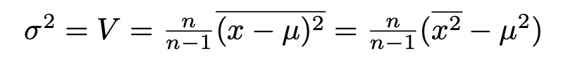
What is less well known is how to safely evaluate standard deviations. Here one hits a second problem. The algebra runs
where the n/(n-1) factor, Bessel’s correction, just compensates for the fact that the squared standard deviation or variance of a sample is a biassed estimator of that of the parent. We know how to calculate the mean safely, and we can calculate the mean square in the same way. However we then hit another problem if, as often happens, the mean is large compared to the standard deviation.
Suppose what we’ve got is approximately Gaussian (or normal, if you prefer) with a mean of 100 and a standard deviation of 1. Then the calculation in the right hand bracket will look like
10001 – 10000
which gives the correct value of 1. However we’ve put two five-digit numbers into the sum and got a single digit out. If we were working to 5 significant figures, we’re now only working to 1. If the mean were ~1000 rather than ~100 we’d lose two more. There’s a significant loss of precision here.
If the first rule is not to add two numbers of different magnitude, the second is not to subtract two numbers of similar magnitude. Following these rules is hard because an expression like x+y can be an addition or a subtraction depending on the signs of x and y.
This danger can be avoided by doing the calculation in two passes. On the first pass you calculate the mean, as before. On the second pass you calculate the mean of (x-μ)2 where the differences are sensible, of order of the standard deviation. If your data is in an array this is pretty easy to do, but if it’s being read from a file you have to close and re-open it – and if the values are coming from an online data acquisition system it’s not possible.
And there is a solution. It’s called the Welford Online Algorithm and the code can be written as a simple extension of the running-mean program above
The subtractions and the additions are safe. The use of both the old and new values for the mean accounts algebraically, as Welford showed, for the change that the mean makes to the overall variance. The only differences from our original running average program are the need to keep track of both old and new values, and initially defining the mean as the first element (zero), so the loop starts at j=1, avoiding division by zero: the variance estimate from a single value is meaningless. (It might be good to add a check that n>1 to make it generally safe).
I had suspected such an algorithm should exist but, after searching for years, I only found it recently (thanks to Dr Manuel Schiller of Glasgow University). It’s beautiful and its useful and it deserves to be more widely known.
It is amazing how simple computation can have profound complexity once you start digging.
I just posted a tweet asking how best to dissuade a colleague from presenting results using Excel.
The post had a fair impact – many likes and retweets – but also a lot of people saying, in tones from puzzlement to indignation, that they saw nothing wrong with Excel and this tweet just showed intellectual snobbery on my part.
A proper answer to those 31 replies deserves more than the 280 character Twitter limit, so here it is.
First, this is not an anti-Microsoft thing. When I say “Excel” I include Apple’s Numbers and LibreOffice’s Calc. I mean any spreadsheet program, of which Excel is overwhelmingly the market leader. The brand name has become the generic term, as happened with Hoover and Xerox.
Secondly, there is nothing intrinsically wrong with Excel itself. It is really useful for some purposes. It has spread so widely because it meets a real need. But for many purposes, particularly in my own field (physics) it is, for reasons discussed below, usually the wrong tool.
The problem is that people who have been introduced to it at an early stage then use it because it’s familiar, rather than expending the effort and time to learn something new. They end up digging a trench with a teaspoon, because they know about teaspoons, whereas spades and shovels are new and unfamiliar. They invest lots of time and energy in digging with their teaspoon, and the longer they dig the harder it is to persuade them to change.
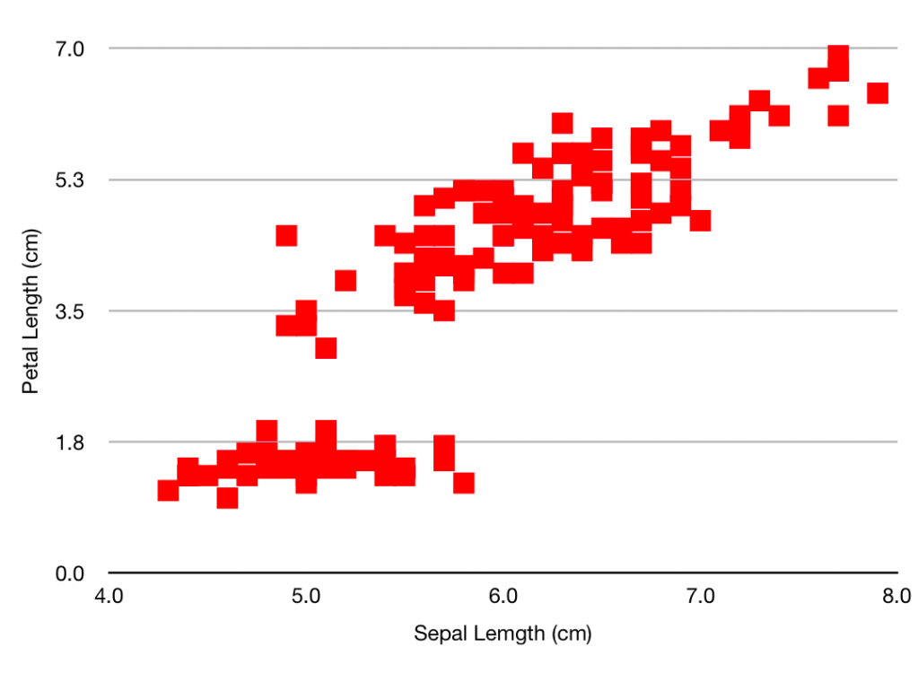
From the Apple Numbers standard example. It’s all about sales.
The first and obvious problem is that Excel is a tool for business. Excel tutorials and examples (such as that above) are full of sales, costs, overheads, clients and budgets. That’s where it came from, and why it’s so widely used. Although it deals with numbers, and thanks to the power of mathematics numbers can be used to count anything, the tools it provides to manipulate those numbers – the algebraic formulae the graphs and charts – are those that will be useful and appropriate for business.
That bias could be overcome, but there is a second and much bigger problem. Excel integrates the data and the analysis. You start with a file containing raw numbers. Working within that file you create a chart: you specify what data to plot and how to plot it (colours, axes and so forth). The basic data is embellished with calculations, plots, and text to make (given time and skill) a meaningful and informative graphic.
In the alternative approach (the spade or shovel of the earlier analogy) is to write a program (using R or Python or Matlab or Gnuplot or ROOT or one of the many other excellent languages) which takes the data file and makes the plots from it. The analysis is separated from the data.
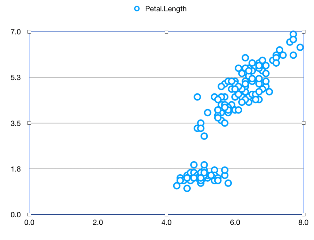
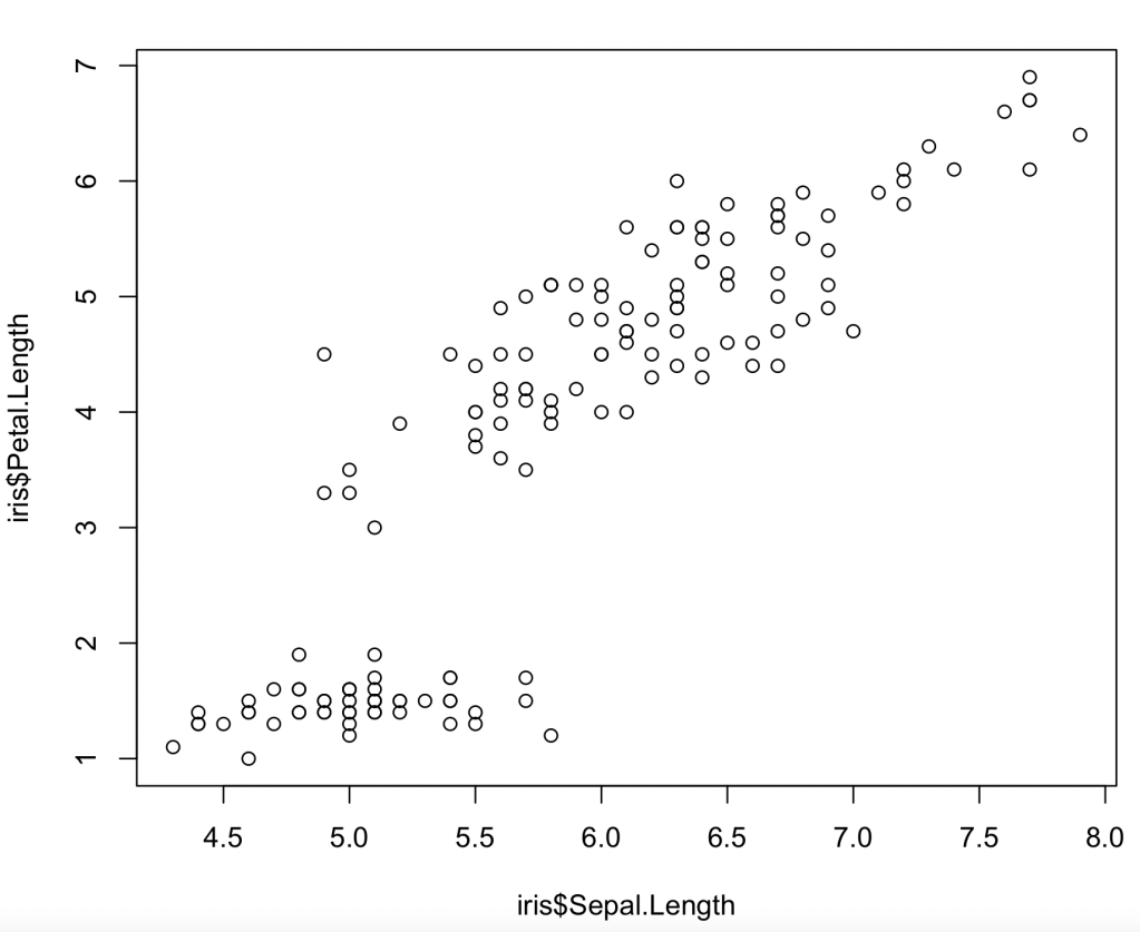
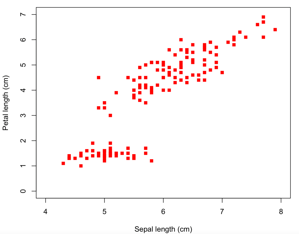
Let’s see how this works and why the difference matters. As a neutral example, we’ll take the iris data used by Fisher and countless generations of statistics students. It’s readily available. Let’s suppose you want to plot the Sepal length against the Petal length for all the data. It’s very easy, using a spreadsheet or using a program
Using Apple Numbers (other spreadsheets will be similar) you download the iris data file, open it, and click on
Chart
Scatter-plot icon.
“Add Data”
Sepal Length column
Petal Length column
and get
In R (other languages will be similar) you read the data (if necessary) and then draw the desired plot
Having looked at your plot, you decide to make it presentable by giving the axes sensible names, by plotting the data as solid red squares, by specifying the limits for x as 4 – 8 and for y as 0 – 7, and removing the ‘Petal length’ title.
Going back to the spreadsheet you click on:
The green tick by the ‘Legend’ box, to remove it
“Axis”
Axis-scale Min, and insert ‘4’ (the other limits are OK)
Tick ‘Axis title’
Where ‘Value Axis’ appears on the plot, over-write with “Sepal Length (cm)”
‘Value Y’
Tick ‘Axis title’
Where ‘Value Axis’ appears, over-write with “Petal Length(cm)”
“Series”
Under ‘Data Symbols’ select the square
Click on the chart, then on one of the symbols
“Style”
‘Fill Color’ – select a nice red
‘Stroke Color’ – select the same red
In R you type the same function with some extra arguments
So we’ve arrived at pretty much the same place by the two different routes – if you want to tweak the size of the symbols or the axis tick marks and grid lines, this can be done by more clicking (for the spreadsheet) or specifying more function arguments (for R). And for both methods the path has been pretty easy and straightforward, even for a beginner. Some features are not immediately intuitive (like the need to over-write the axis title on the plot, or that a solid square is plotting character 15), but help pages soon point the newbie to the answer.
The plots may be the same, but the means to get there are very different. The R formatting is all contained in the line
whereas the spreadsheet uses over a dozen point/click/fill operations. Which are nice in themselves but make it harder to describe what you’ve done – that left hand column up above is much longer than the one on the right. And that was a specially prepared simple example. If you spend many minutes of artistic creativity improving your plot – changing scales, adding explanatory features, choosing a great colour scheme and nice fonts – you are highly unlikely to remember all the changes you made, to be able to describe them to someone else, or to repeat them yourself for a similar plot tomorrow. And the spreadsheet does not provide such a record, not in the same way the code does.
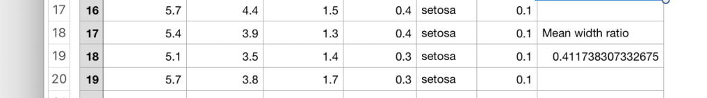
Now suppose you want to process the data and extract some numbers. As an example, imagine you want to find the mean of the petal width divided by the sepal width. (Don’t ask me why – I’m not a botanist).
Click on rightmost column header (“F”) and Add Column After.
Click in cell G2, type “=”, then click cell C2, type “/”, then cell E2, to get something like this
(notice how your “/” has been translated into the division-sign that you probably haven’t seen since primary school. But I’m letting my prejudice show…)
Click the green tick, then copy the cell to the clipboard by Edit-Copy or Ctrl-C or Command-C
Click on cell G3, then drag the mouse as far down the page as you can, then fill those cells by Edit-Paste or Ctrl-V or Command-V
Scroll down the page, and repeat until all 150 rows are filled
Add another column (this will be H)
Somewhere – say H19 – insert “=” then “average(“,click column G , and then “)”. Click the green arrow
Then, because it is never good just to show numbers, in H18 type “Mean width ratio”. You will need to widen the column to get it to fit
It’s now pretty clear that even for this simple calculation the program is a LOT simpler than the spreadsheet. It smoothly handles the creation of new variables, and mathematical operations. Again the program is a complete record of what you’ve done, that you can look at and (if necessary) discuss with others, whereas the contents of cell 19 are only revealed if you click on it.
As an awful warning of what can go wrong – you may have spotted that the program uses “mean” whereas the spreadsheet uses “average”. That’s a bit off (Statistics 101 tells us that the mode, the mean and the median are three different ‘averages’) but excusable. What is tricky is that if you type “mean(” into the cell, this gets autocorrected to “median(“. What then shows when you look at the spreadsheet is a number which is not obviously wrong. So if you’re careless/hurried and looking at your keyboard rather than the screen, you’re likely to introduce an error which is very hard to spot.
This difference in the way of thinking is brought out if/when you have more than one possible input dataset. For the program, you just change the name of the data file and re-run it. For the spreadsheet, you have to open up the new file and repeat all the click-operations that you used for the first one. Hopefully you can remember what they are – and if not, you can’t straightforwardly re-create them by examining the original spreadsheet.
So Excel can be used to draw nice plots and extract numbers from a dataset, particularly where finance is involved, but it is not appropriate
If you want to show someone else how you’ve made those plots
If you are not infallible and need to check your actions
If you want to be able to consider the steps of a multi-stage analysis
If you are going to run the same, or similar, analyses on other datasets
and as most physics data processing problems tick all of these boxes, you shouldn’t be using Excel for one.
In any description if the Standard Model of Particle Physics, from the serious graduate-level lecture course to the jolly outreach chat for Joe Public, you pretty soon come up against a graphic like this.
“Particles of the Standard Model”
It appears on mugs and on T shirts, on posters and on websites. The colours vary, and sometimes bosons are included. It may be – somewhat pretentiously – described as “the new periodic table”. We’ve all seen it many times. Lots of us have used it – I have myself.
And it’s wrong.
Fundamentally wrong. And we’ve known about it since the 1990’s.
The problem lies with the bottom row: the neutrinos. They are shown as the electron, mu and tau neutrinos, matching the charged leptons.
But what is the electron neutrino? It does not exist – or at least if it does exist, it cannot claim to be a ‘particle’. It does not have a mass. An electron neutrino state is not a solution of the Schrödinger equation: it oscillates between the 3 flavours. Anything that changes its nature when left to itself, without any interaction from other particles, doesn’t deserve to be called an ‘elementary particle’.
That this changing nature happened was a shattering discovery at the time, but now it’s been firmly established over 20 years of careful measurement of these oscillations: from solar neutrinos, atmospheric neutrinos, reactors, sources and neutrino beams.
There are three neutrinos. Call them 1, 2 and 3. They do have definite masses (even if we don’t know what they are) and they do give solutions of the Schrödinger equation: a type 1 neutrino stays a type 1 neutrino until and unless it interacts, likewise 2 stays 2 and 3 stays 3.
So what is an ‘electron neutrino’? Well, when a W particle couples to an electron, it couples to a specific mixture of ν1, ν2, and ν3, That specific mixture is called νe. The muon and tau are similar. Before the 1990s, when the the only information we had about neutrinos came from their W interactions, we only ever met neutrinos in these combinations so it made sense to use them. And they have proved a useful concept over the years. But now we know more about their behaviour – even though that is only how they vary with time – we know that the 1-2-3 states are the fundamental ones.
By way of an analogy: the 1-2-3 states are like 3 notes, say C, E and G, on a piano. Before the 1990s our pianist would only play them in chords: CE, EG and CG (the major third, the minor third and the fifth, but this analogy is getting out of hand…) As we only ever met them in these combinations we assumed that these were the only combinations they ever occurred in which made them fundamental. Now we have a more flexible pianist and know that this is not the case.
We have to make this change if we are going to be consistent between the quarks in the top half of the graphic and the leptons in the bottom. When the W interacts with a u quark it couples to a mixture of d, s and b. Mostly d, it is true, but with a bit of the others. We write d’=Uudd+Uuss+Uubb and introduce the CKM matrix or the Cabibbo angle. But we don’t put d’ in the “periodic table”. That’s because the d quark, the mass eigenstate, leads a vigorous social life interacting with gluons and photons as well as Ws, and it does so as the d quark, not as the d’ mixture. This is all obvious. So we have to treat the neutrinos in the same way.
So if you are a bright annoying student who likes to ask their teacher tough questions (or vice versa), when you’re presented with the WRONG graphic, ask innocently “Why are there lepton number oscillations among the neutral leptons but not between the charged leptons?”, and retreat to a safe distance. There is no good answer if you start from the WRONG graphic. If you start from the RIGHT graphic then the question is trivial: there are no oscillations between the 1-2-3 neutrinos any more than there are between e, mu and tau, or u, c, and t. If you happen to start with a state which is a mixture of the 3 then of course you need to consider the quantum interference effects, for the νe mixture just as you do for the d’ quark state (though the effects play out rather differently).
So don’t use the WRONG Standard model graphic. Change those subscripts on the bottom row, and rejoice in the satisfaction of being right. At least until somebody shows that neutrinos are Majorana particles and we have to re-think the whole thing…


